


Stay with me! This one is big.
It's definitely one of the longests missions I've had as Product Designer.
I honestly don't expect you to read all of this. And I purposefully decided to merge all advancements in this one case. They're particular to one product I worked through my whole time at Woba. I'm proud of it, and I hope you see value in it too.
Feel free to skip some headings, or run an LLM on top of this page.
Anyways. Here it goes!
It was 2023, and the Manager Dashboard was trapped in kind of an invisible cage.
It worked. It showed data. It allowed basic management. But it was light-years away from being a real SaaS platform. Every new request became a patch or, say, a differently flavored cookie. Every large client asked for something the system didn't support. And the Customer Success team lived putting out fires, answering questions the dashboard should answer on its own. They were clearly running out of water to cease the fire, and we had big troubles on our hands.
So, our mission? To transform a consultation tool into an enterprise self-management platform. Without stopping what already existed. No big bang. No rewriting everything from scratch.
So, this novel-styled case tells the story of almost 3 years of incremental, constant, and strategic evolution that transformed the Manager Dashboard into one of Woba's main products.
The scenario: when "checking data" isn't enough
In 2022, when I joined the Manager squad, the dashboard was basically a consultation panel. Managers could see:
Reservations made by employees
A list of registered members
Some usage graphs
But it lacked action. It lacked control. It lacked financial transparency. And especially, it lacked autonomy.
The result? Managers called CS. CS opened tickets to Tech. Tech made manual adjustments in the database. A vicious cycle that consumed hours and frustrated everyone.
Starting in 2023, we began an evolution journey that would change all this. For good.
2023: Financial transparency and foundations for the future
Financial Control Module
The first big bet was giving transparency about spending. Until then, managers couldn't see how much they were spending in real time. They depended on emails, CS spreadsheets, or just guessing.
We created a module that displayed:
Total spending in credits (internal currency) and reais
Filters by period, city, and cost center
Evolution chart of spending over time
Consumption by product type (workstations, rooms, events)
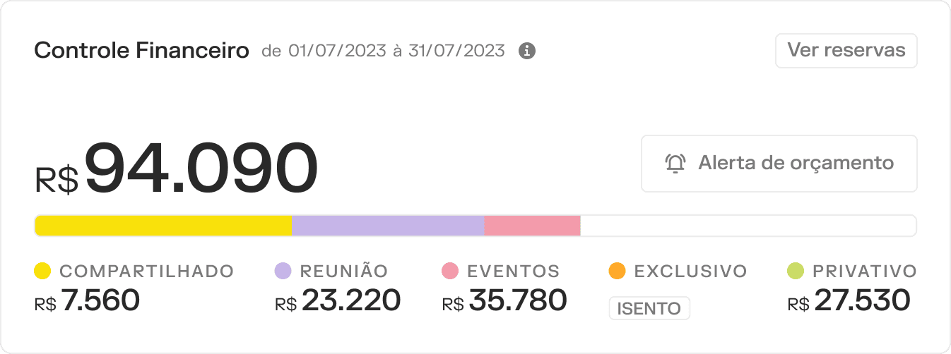
Financial transparency module showing total spending breakdown by period, city, cost center, and product type. The first step toward manager autonomy.
Seems simple, right? But there was a brutal challenge: data parity. We needed to ensure the value shown in the dashboard matched exactly what the Data team had in their sources. If not, it would generate even more work for CS explaining discrepancies.
We worked with Data to structure queries that matched. It wasn't 100% perfect at first. We had difficulties, adjustments, refinements. But it gave some transparency to managers who'd never had this before.
2024: The year of structural transformation
2024 was intense. Not just because of the volume of deliveries, but because we started restructuring Woba's entire business model, and the Manager Dashboard needed to reflect this.
Evolution of Usage Page → Data and Insights
The old "Usage" page was basically a list of reservations with filters. Functional, but didn't generate insights.
We redesigned it to become a strategic data hub:
Usage ranking: Top 5 cities, most reserved spaces, most active groups and most active employees.
Usage map: geographic visualization state-by-state presenting numbers for total amount of spaces, cities and states where employees had made reservations.
Detailed table with all reservation data (date, time, status, credits, name, email, product, space, and so on).
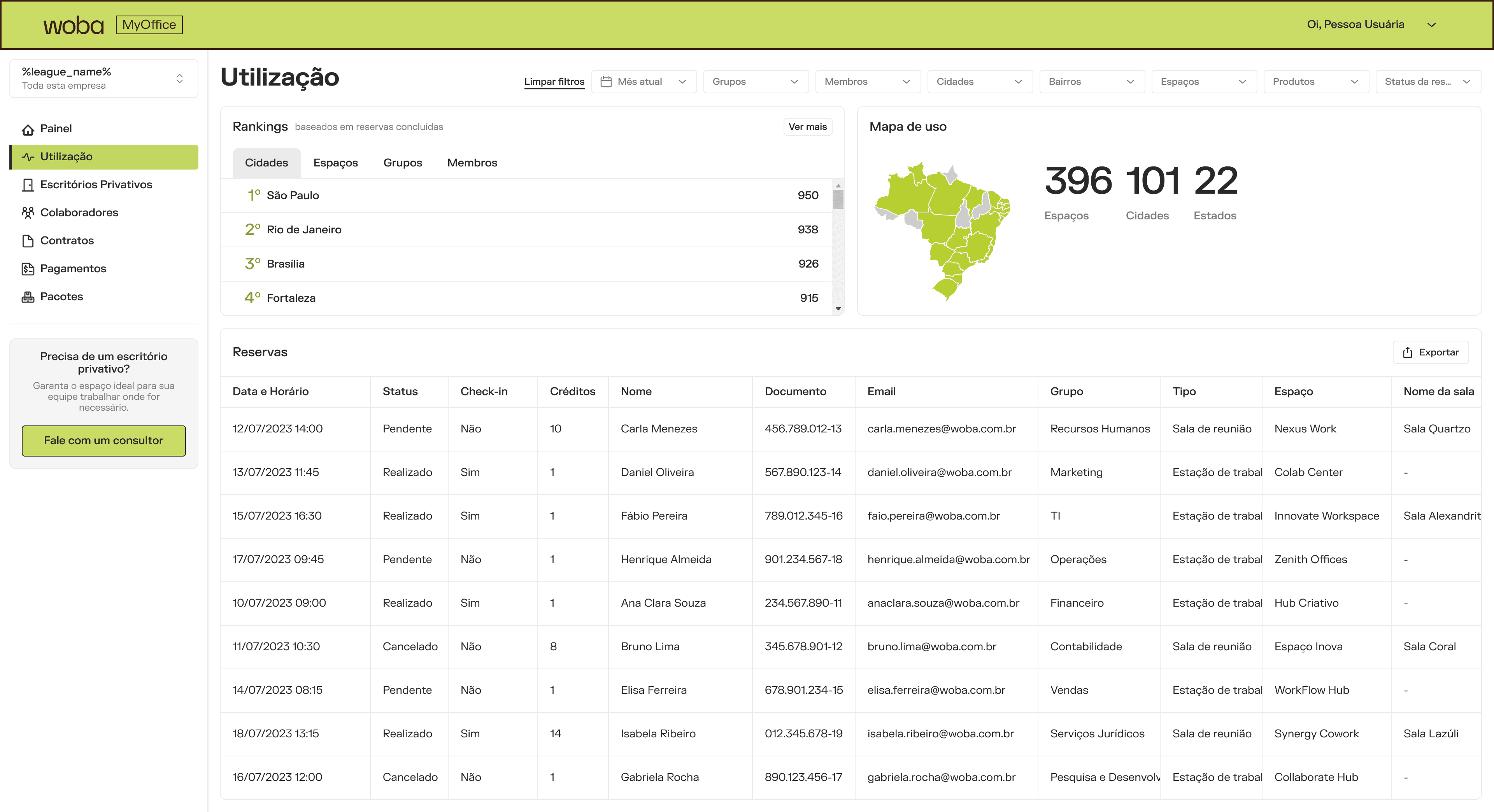
Strategic data hub with rankings, geographic visualization, and detailed reservation tables transforming raw data into actionable narratives.
The idea was simple: transform raw data into narratives. The manager looks and quickly understands: "Oh, the São Paulo team consumes much more than Rio" or "Meeting rooms are our main expense".
Manager feedback: "Finally I can justify to finance why we renew the contract". Several managers started using dashboard screenshots in internal presentations.
Business Platform and New Package Architecture
Here began the paradigm shift.
Before, each company had one monolithic contract. Everything in one place: how many credits, which products, how much it costs, when it renews. If the company wanted different conditions for Marketing vs. Operations? Manual spreadsheet, database exception, headache.
The Business Platform Squad was born to solve exactly this. And we had the mission to evolve the Manager Dashboard to reflect the new business model.
Creating the Packages Page
A quick recall of what this new business model entails:
Contracts (the master umbrella)
Packages (operational units, each with specific products and credits)
Cycles (validity periods within each package)
Payments (installments and charges associated)
All this data was dealt on back-office systems, and needed to appear bit by bit on the Manager Dashboard, for transparency and parity purposes. We needed to expose to the manager:
Which packages they have active
How much credit remains in each one
Which products each package enables
Consumption history by cycle
Associated payments
To me, this was one of the most complex deliveries of the year.
I had to work in close collaboration with the Business Platform Squad, and that was an easy feat since… I was the Product Designer on both squads. As we were building the logic in the BackOffice (internal interface), it became clearer to me what needed to be designed. And that was: Package cards! It needed to show the following:
Package type (company-wide or by group).
Enabled products with clear icons.
Credit consumption progress bar.
Current cycle validity period.
Amount used and overages.
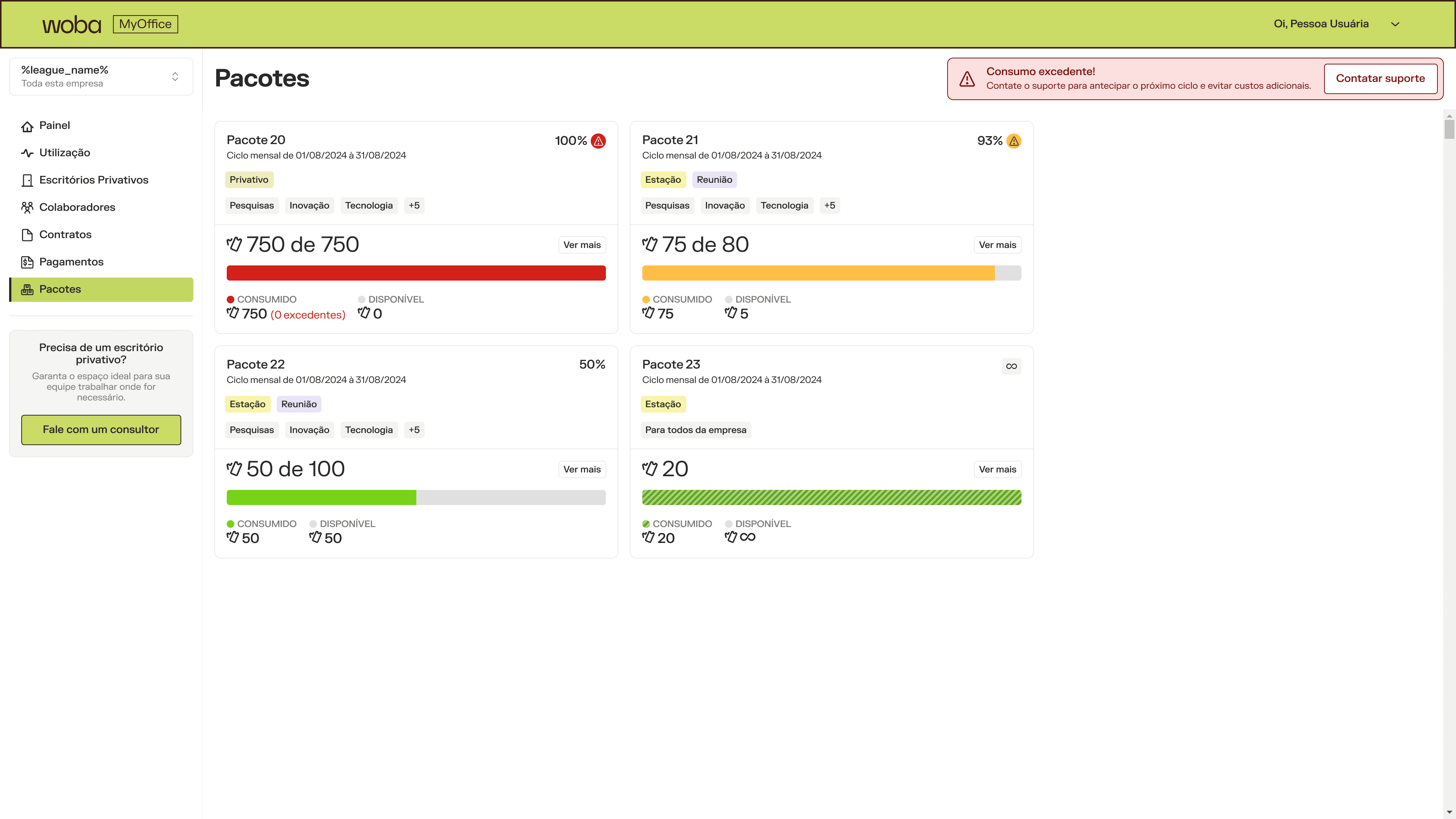
Package cards displaying type, enabled products, credit consumption progress, cycle validity, and usage totals at a glance.
Crucial detail: When a manager clicked on a package, it opened a details screen with:
Complete history of all cycles (past, present, future).
Consumption chart over time.
List of reservations linked to that package.
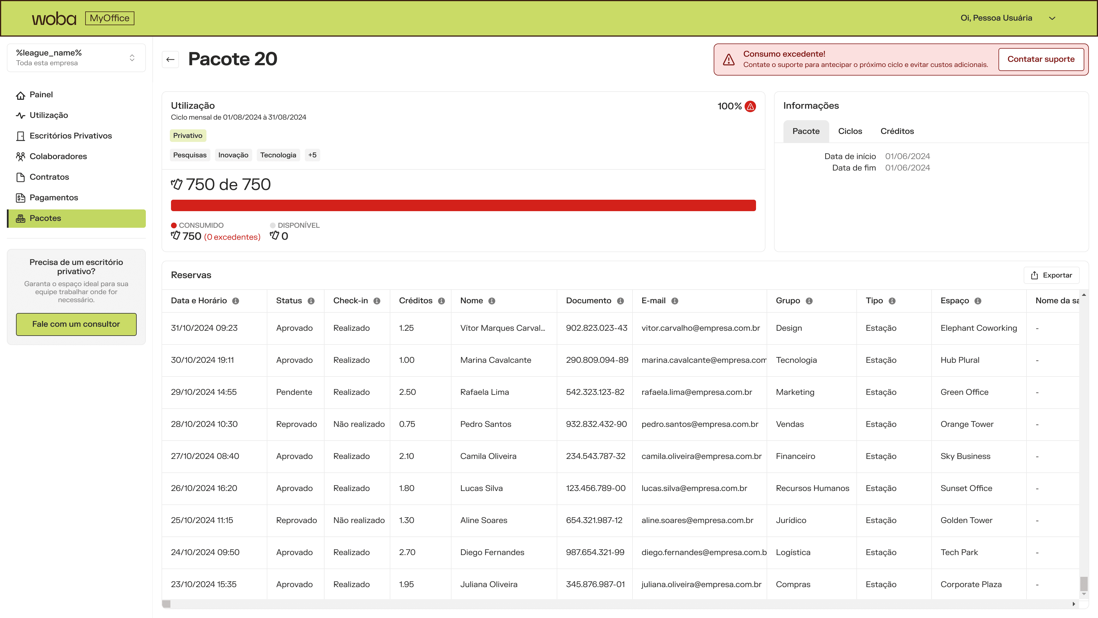
Complete package details screen with cycle history, consumption trends, and linked reservations for full transparency.
Complete Overhaul of Employees Page
The old "Members" page was confusing. It had tabs with nomenclature nobody understood: "Members", "Eligible", "Guests". And you couldn't do batch actions, didn't show history, didn't display relevant metrics.
We redesigned from scratch:
New grouping: Active, Awaiting Approval, Guests
Visual bar showing status distribution
Additional columns: Department, Account creation date, Total reservations, Last booking, Badge with traffic light for days without booking
Enhanced filters: by role, group, status
Batch actions: change plan, group, remove multiple users at once
Revamped invite modal (before it was confusing, now it's clear step-by-step)
Performance: We resolved technical debts that caused white screen when loading and delay updating data after changes.
Status: Partially implemented in 2024, with continuous improvements in 2025.
Bulk Member Import
Before, managers added employees one by one. Or asked CS to do it via spreadsheet in the backend.
We created a complete import flow:
Download template with required columns and examples
Upload spreadsheet with automatic validation
Error review screen (showed exactly what was wrong in each line and how to fix it)
Final confirmation with summary of what would be imported
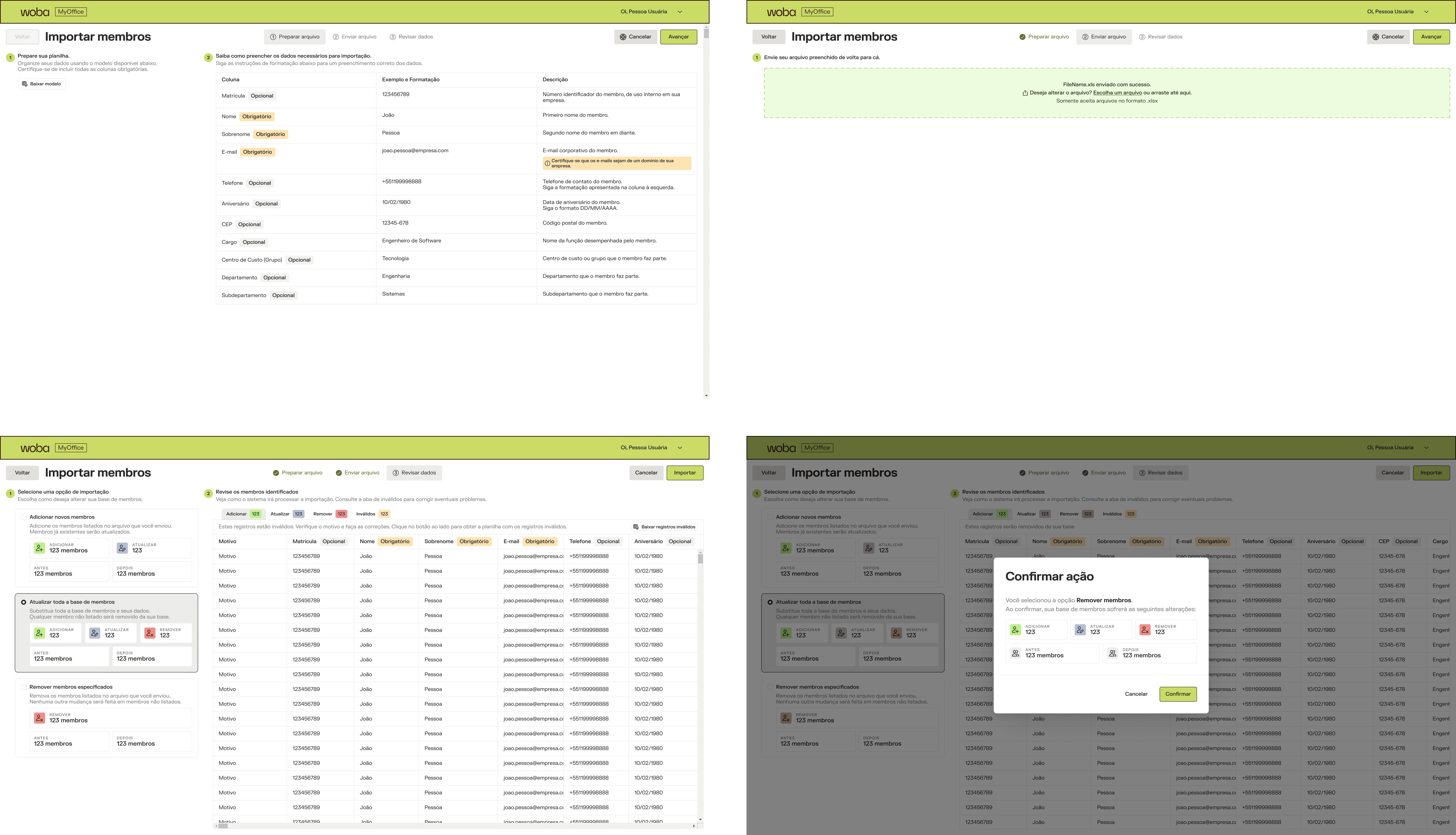
Four-step validation flow: download template, upload with auto-validation, review errors, confirm import. Self-service at scale.
Result: Large companies (200+ employees) could onboard 10x faster. Drastic reduction in CS tickets asking "add these 50 users for me".
Tracking: We configured events in Amplitude to measure adoption. In the first 45 days after launch, 9 accesses to the flow, 4 unique users. It wasn't explosive, but for companies that used it, saved hours of work.
You can read more on this here!
Submanager Dashboard
Large companies don't have just one manager. They have submanagers by area, region, department.
We created a submanager profile with restricted visibility to the groups they manage. They don't see data from the entire company, only their scope.
I designed:
Context selector (for submanagers who manage multiple groups)
Adapted panel showing only relevant data
Error modal when submanager tries to access something outside their scope (with clear explanation of why)
Role designation flow (managers can promote other users to managers or submanagers)
Validation: We tested with Cielo, first company to use submanagers. Initial feedback positive, but identified improvement points that entered the 2025 backlog.
Data Export
Managers wanted to be able to extract data for their own analyses, presentations, internal reports.
We implemented export in CSV/Excel of:
Reservations (with all applied filters)
Employees (with status, groups, history)
Packages and consumption
UX detail: Before exporting, we showed preview of what would be exported and how many lines. Avoided surprises of "downloaded 50 thousand lines by accident".
2025: Maturation and automation
Automatic Package Consumption Alerts
This was one of the most request features from clients. In 2025, we managed to launch automatic alerts via email and WhatsApp when package reaches a configured threshold (e.g., 80% consumption).
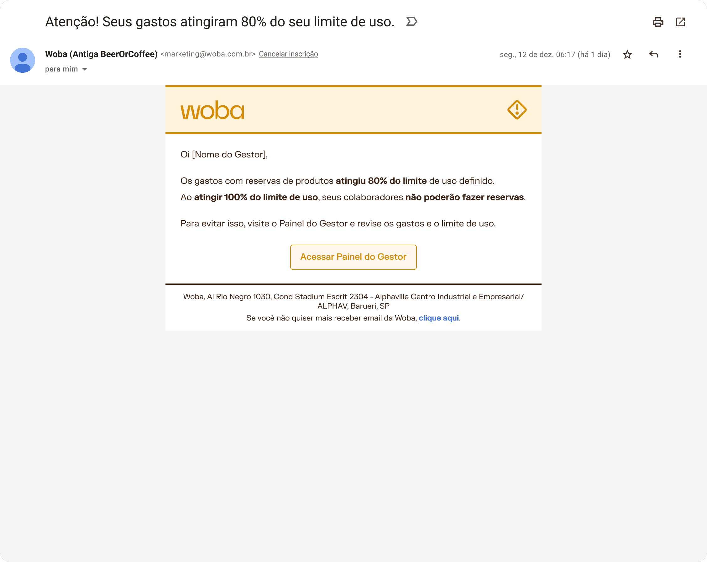
Automated alerts via email and WhatsApp when package consumption reaches configured thresholds (80% default).
We also configured alerts for CS team and KAMs on Slack/HubSpot, so they could be proactive in renewal or upgrade offers.
Technology: We integrated with CleverTap via External Trigger API.
Company Selector
Some users (especially KAMs and support people) manage multiple companies.
We created a context selector that allows quick switching between companies without logging out/in. Seems small, but saves dozens of clicks per day.
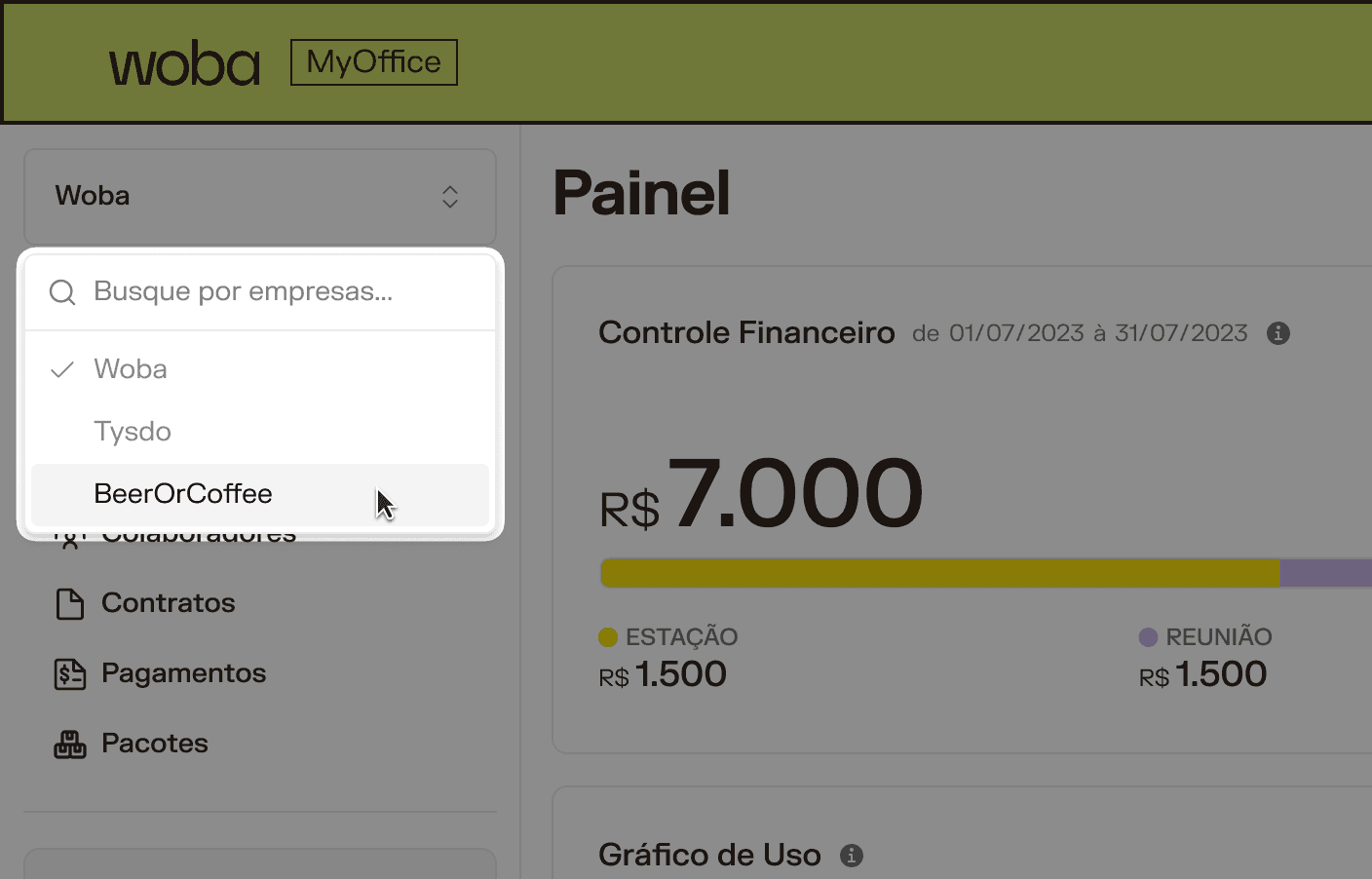
Context switcher enabling KAMs and support users to manage multiple companies without repeated logins. Dozens of clicks saved daily.
Continuous Improvements in Employees and Packages
Bulk role editing (manager selects several employees and changes everyone's role at once)
Better visibility of bulk modifications (before it was hidden, now it's highlighted)
Package cards with clear indication if it's company-wide or by group
Global permission management component (to facilitate fine access control)
Visual Adjustments and Performance
Skeleton states for loading (instead of white screen)
Collapsible side menu (better space utilization)
Improved empty states (more instructive, with clear CTAs)
Multiple line selection in tables with global checkbox (inspired by ClickUp and Supabase)
Enhanced filters on Usage page (faster, more visual)
What changes came with this journey
Metrics we have:
Manager MAU rose consistently since 2023 (no exact published number, but observable growth).
Reduction in CS tickets related to "how do I see my spending" and "how do I add users".
Member import adoption: ~9 accesses in first 45 days post-launch (low, but high impact for those who used it).
Positive qualitative feedback about financial transparency and autonomy.
What we couldn't measure:
Direct impact on customer churn (correlation with dashboard usage).
Time saved per manager using new features vs. asking CS for help.
Adoption by feature in granular form (partial tracking in Amplitude, but not complete).
What I learned from all this
Incremental evolution beats big bang. We tried to change everything at once in the beginning, and it didn't work. When we started delivering small frequent improvements, the cumulative impact was much greater.
Transparency generates trust. The financial module was a watershed. When managers can see exactly what they're spending and why, the platform's value perception changes.
Instruction embedded in UI > external documentation. Tooltips, well-written empty states, clear error messages. It all reduces friction without requiring users to read a manual.
Cross-squad collaboration is essential. The work with the Flexible Subscription Squad was fundamental. It's no use having beautiful logic in the BackOffice if the Manager Dashboard can't explain that to the end user as well.
Not everything we designed was implemented, and that's okay. What mattered was documenting, validating, and leaving it ready for when business timing allows resuming.
Why tell this story (and not just the highlights)
Because design is THE PROCESS, not just delivery.
It would be easy to write down a case just with victories: "We created the financial module! We redesigned the packages page! We launched the member import flow!". But in reality is the work was incremental, negotiated, adjusted, rethought, SEVERAL times.
Some things worked on the first try. Others needed 3 iterations. And some stayed in the backlog waiting for the right moment to shine.
If you're a recruiter or manager reading this, know that this project shows:
Ability to navigate business complexity (flexible subscription model isn't trivial).
Strategic product vision (not just designing screens, but understanding impact on sales funnel, retention, support).
Resilience and pragmatism (knowing what to prioritize, what to leave for later, and how to document decisions).
Cross-functional collaboration (working with Data, CS, Sales, Finance, Legal, other squads).
And if you're a designer, know that your projects won't always have clear beginning, middle, and end. Sometimes you're baking a cake, crumb by crumb, and only realize how delicious it tastes moments later.