


When I joined Woba in May 2022, there were buttons in many different shades of blue. No, I'm not exaggerating.
The company was gearing up for a major transformation: the rebrand from BeerOrCoffee to Woba was on the horizon. But the design infrastructure simply didn't exist. No component library. No documentation. Each designer and developer made their own interpretations of "what a button should look like," and the result was exactly what you'd imagine: products that looked like they'd been designed by completely different teams.
My first mission was clear but daunting: build a Design System from scratch.
The audit revealed a digital patchwork quilt
I started by doing what any designer would do when entering a new house: I opened every cabinet. I went through each of the company's digital products (the manager dashboard, partner dashboard, mobile app, public website) and did a complete audit. I cataloged every component I found: buttons (oh, the buttons), cards, inputs, modals, badges, chips, tables, forms, navigation, empty states, skeletons.
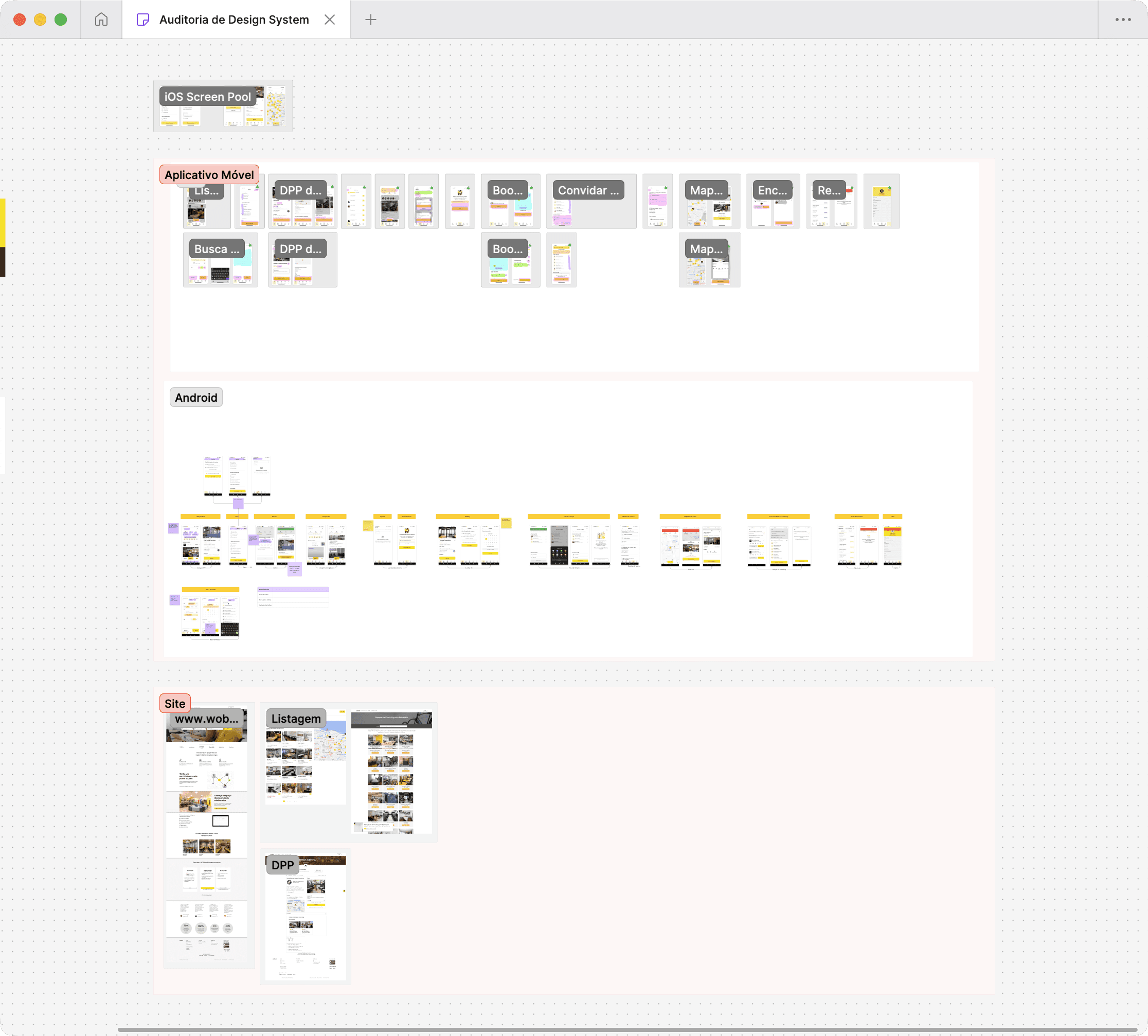
A comprehensive whiteboard of screens spanning all three major platforms where Woba had published apps and public-facing websites.
What I discovered was both intriguing and concerning. There were emerging patterns, yes, but there were also random variations. An input had rounded corners of 4px here, 6px there, 8px elsewhere. The colors? A festival. Some elements used the same color but with different opacities, others used completely different colors for the same function. It was like each feature had been designed in a parallel universe.
But I had a plan. And I had a tight deadline, because the brand transition was nearing the corner.
Setting the stage for a complete identity shift
Here was the challenge: there was no point creating a Design System with BeerOrCoffee's colors and typography if, in a few months, everything would change to Woba. So from day one, I thought strategically. I used color styles and text styles, which are the precursors to what we now call variables/tokens, to create an abstraction layer.
I mapped each component in Figma, designed clean and consistent versions, and organized them into a library. Buttons with clear variants: size (small, medium, large), type (primary, secondary, tertiary), state (default, hover, pressed, disabled). Inputs with visual validation. Modular cards. Everything designed to be easily updatable when the new identity arrived.
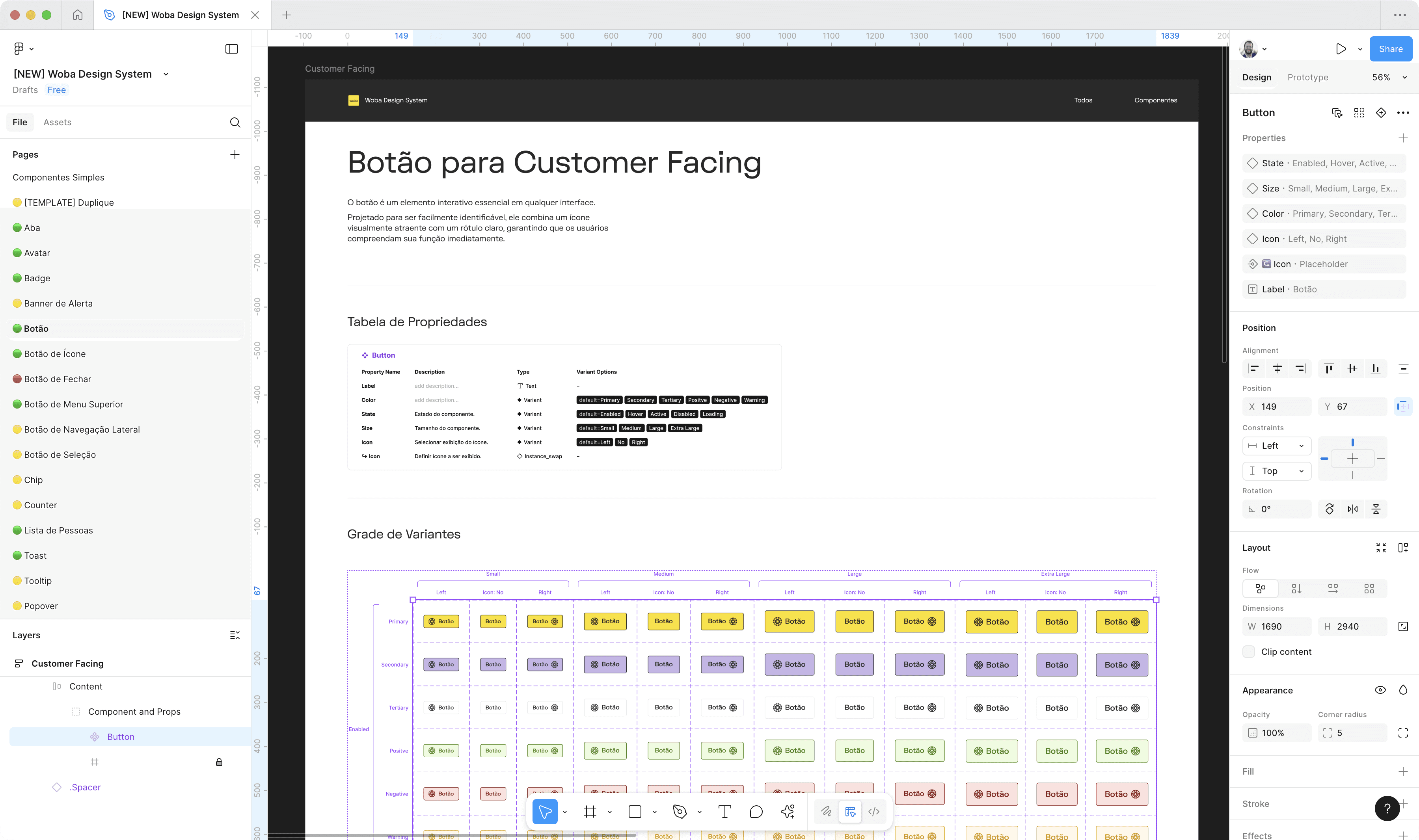
Clean button variants organized by size (small, medium, large), type (primary, secondary, tertiary), and state (default, hover, pressed, disabled). Ready to scale.
October 2022 arrived, and with it, Woba.
The rebrand was the moment of truth. Thanks to the styles I'd configured, we managed to update the entire interface of all products in just a few days. It wasn't just swapping a logo. It was redefining entire color palettes, typographic hierarchy, spacing, shadows. If I hadn't prepared the Design System with this transition in mind, it would've taken months. But we were ready.
The new Woba visual identity applied across all products thanks to the abstraction layer built with styles and tokens.
And suddenly, the inconsistencies that previously hid under the old brand appeared under spotlights with the new identity.
Evolution never stops: tokens, variants, and component anatomy
2023 was the year of technical maturity. With the library functioning, I started focusing on what would really make it scale: well-named tokens, intelligent variants, and living documentation.
I created detailed pages in Notion documenting each token group like colors (primary, secondary, neutral, semantic), typography (sizes, weights, line heights), spacing, borders, shadows. It wasn't just "here are the colors," it was "here's the system that governs how we use colors". Each component got its own page with visual anatomy, use cases, dos & don'ts.
Around that time, Figma launched variables, and I embraced the feature immediately. I migrated all the old styles to the new token system. This not only made everything more organized, it enabled advanced scenarios like dark mode.
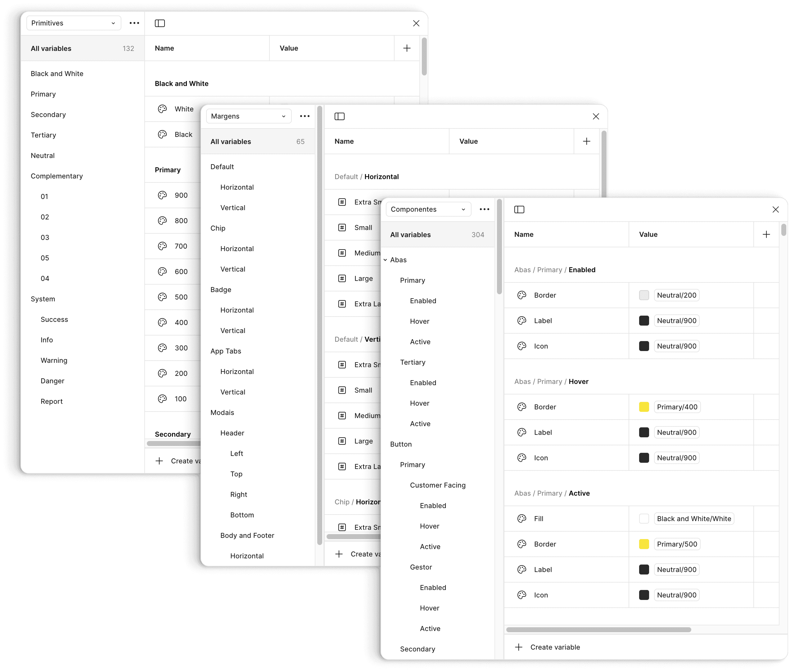
Well-named token system covering colors, typography, spacing, borders, and shadows. The foundation for dark mode and future variants.
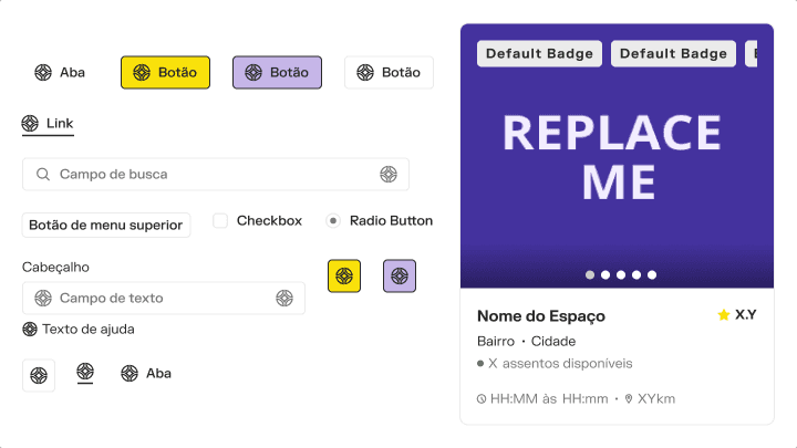
I also refined the variants strategy. It became clear to me that having 50 variants of a component just because "maybe someday someone will need it" was a trap. The solution? Slots and composition. Instead of creating a input field variant for every possible combination, I created a base card with designated content areas (header, body, footer, actions) that could be filled with other components. Fewer explosive variants, more real flexibility.
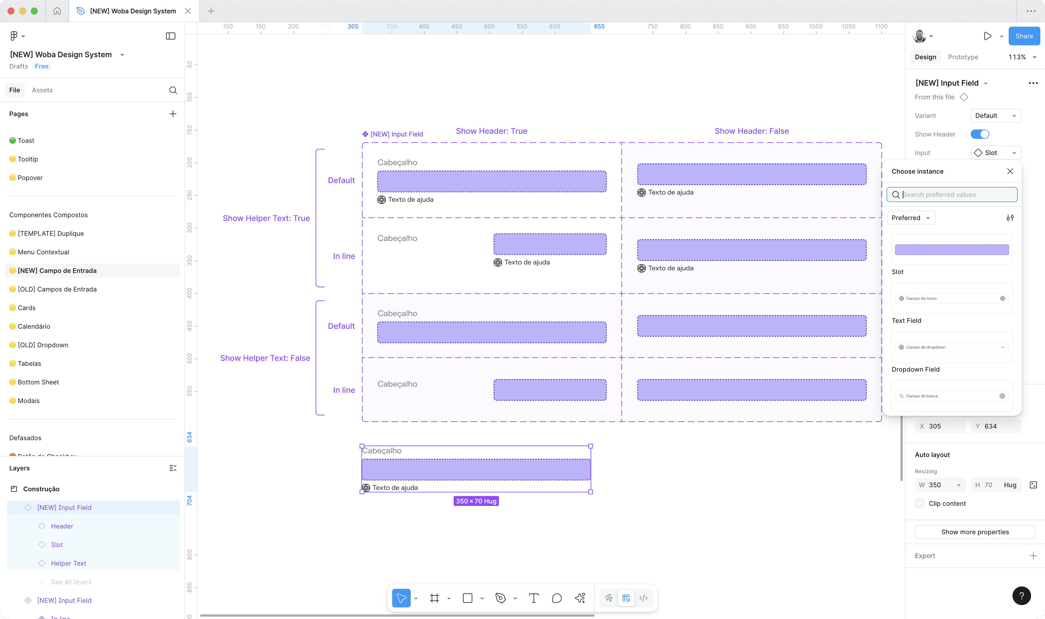
Composition over explosion: slots colored in purple showing available field options, enabling flexible layouts without creating 50+ variants.
Well, you may now know that Figma is releasing their own native solution to slots in November, 2025. That's a win! In the past, that's something we couldn't rely on.
When we kept design "proprietary," the bill came due
But there was an elephant in the room: maintaining fully proprietary components was expensive. Every new component I designed needed to be implemented from scratch by developers. Every visual tweak turned into a long conversation. And worse: while I was in Figma creating "perfect" versions, devs were struggling with CSS and edge cases I couldn't even imagine.
That's when we started flirting with shadcn/ui, while chatting with the tech team.
So shadcn/ui is a collection of React + Tailwind components that isn't exactly a library. It's code you copy and adapt. Meaning: well-designed components, accessible, tested by the community, but 100% customizable because they will live in your repository.
The right moment appeared in 2024.
The Business Platform squad was our laboratory
When we formed the squad to redesign the business model (migrating from fixed contracts to flexible packages), we had the chance to create new interfaces from scratch. Specifically, screens for the BackOffice, the internal system used by Sales, CS, Finance, Supply.
We made the choice: let's use shadcn/ui as a proof of concept.
We chose the most critical components (forms, tables, modals, dropdowns) and adapted them with our tokens. And man, the results were immediate. Development got faster. Interfaces came out cleaner. Devs were happy because they had a solid and predictable foundation. Designers were happy too because parity between Figma and code was almost perfect.
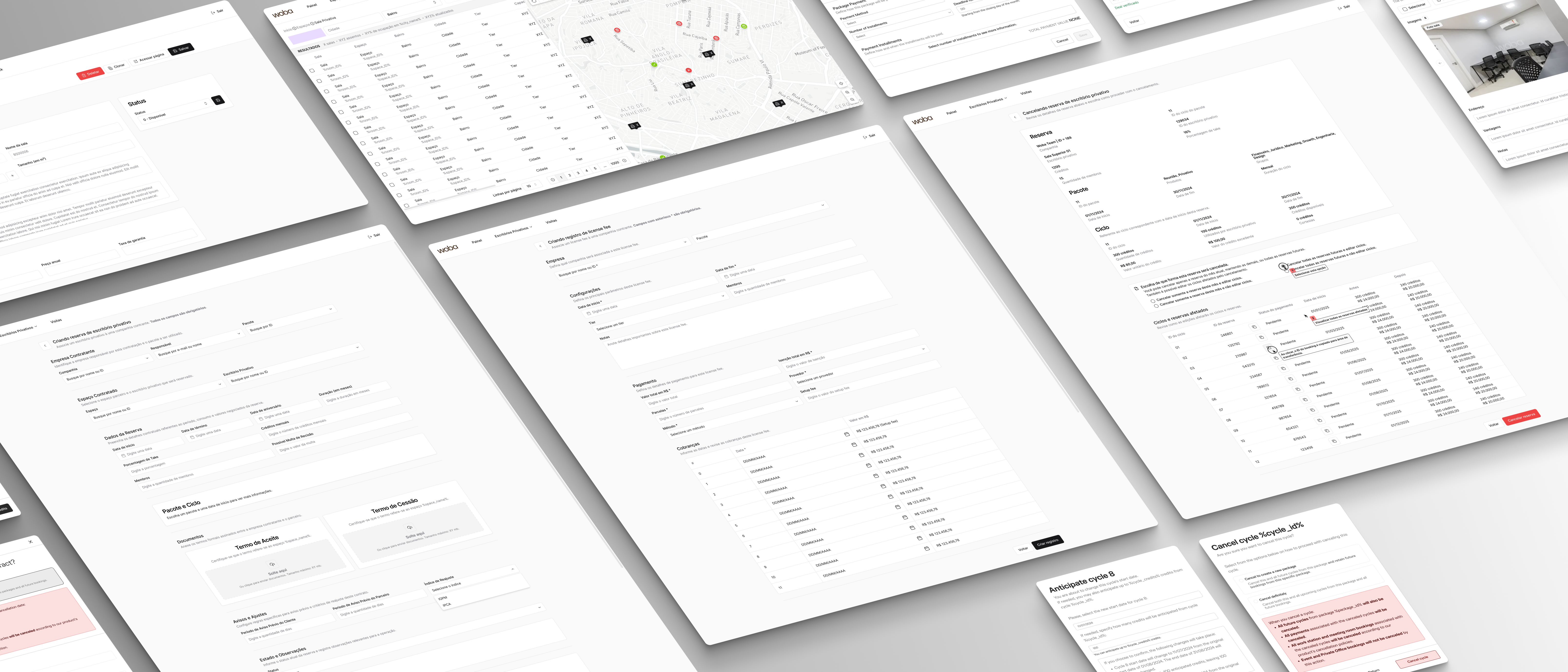
Customized shadcn/ui components with Woba's design tokens in the Business Platform. Proof of concept that became the standard.
It was enough to convince everyone. In the following months, we started gradual migration of old proprietary components being replaced by versions based on shadcn/ui, customized with our tokens, used in different front-ends such as dashboards and mobile apps.
What really changed between design and dev
With shadcn/ui and Figma Dev Mode, handoff became something else.
Before, it was like this: I delivered specs inside Figma using plugins like EightShapes Specs, developers tried to decipher "which spacing exactly is this?", and we went back and forth several times.
Now? Dev Mode shows the tokens right in the panel (e.g., "spacing.md", "color.primary.500"), and devs can even copy reference code snippets.
We also formalized a committee of guardians (me and some tech leads) to ensure that customizations in shadcn/ui didn't become a wild fork.
The journey continued
Before my departure, after 3 years of maintaining and evolving the Design System, the impact was palpable:
Visual consistency between Manager, Partner, App and Web is perceived in all squad reviews.
Reduction in post-handoff adjustments, which really meant much less "this doesn’t look like it what’s in Figma".
Development iterates faster in features using customized shadcn/ui components.
Top tier quality components reviewed by a community of world wide developers.
Onboarding of designers and developers dropped from weeks to days.
But most importantly? The Design System became the single source of truth. When a question arises about "how do we do this?", everyone knows where to look.
What I learned from this
Naming well is designing well. Poorly named tokens become instant technical debt. I spent time thinking about taxonomies and it was worth every second. Make design systems legible!
Documentation is THE product. If developers and PMs can't use it, it doesn't matter how beautiful the file is. I invested as much in Storybook and Notion as in design.
Accepting temporary heterogeneity was crucial. We didn't try to migrate everything at once to shadcn/ui. We maintained parallel systems while proving the concept. This avoided chaos.
Warm heart and head full of patience. This is not a one quarter project, it flows beyond time and space. People come and go, and so does the design system. Someone someday will inherit it. Let’s make sure it won’t be for nothing.