


It was December 2022, and Woba mobile app users were stuck in a frustrating loop.
Picture this: you open the app looking for a meeting room for tomorrow at 2pm. You see a list of beautiful spaces. You click the first one. Fill in date, time, number of attendees. Move to checkout and... "Unavailable at this time."
Okay, go back. Choose another space. Repeat the process. Date, time, attendees. Checkout. "Unavailable."
Again. And again. And again.
With each attempt, you had to re-submit the same parameters. Availability was only shown at the end of the funnel, after you'd already invested time and energy. It was like going to a store, filling your cart, getting to checkout, and only then discovering half the products are out of stock, like, what the heck is that???
This was the reality of searching spaces in the app. And it was impacting the metric that mattered most: search-to-fill.
Search-to-fill: the funnel that moves mountain$
"Search-to-fill" was what we called the complete funnel: from initial search to completing a reservation. View spaces → consider options → select one → enter reservation details → checkout.
The problem? Conversion was bleeding between "select space" and "complete reservation." Especially for meeting rooms, where availability is restrictive (you need specific time, minimum capacity, etc.).
Users were abandoning. Coming back frustrated. Some didn't even try again. Many would reach out to account managers, our loved KAMs. They'd resort to human interfaces instead of the product. We don't exactly want to measure that.
When I joined the Search and Consideration Squad in January 2023, the mission was clear: fix search in the mobile app.
Starting with the pain: what did users actually need?
Before designing any screen, I did my homework. Studied existing flows. Talked to Product, Customer Success, Support, and internal users.
Some of the references I delved into were: Airbnb. Booking.com. Uber, and reservation apps that had solved similar problems.
What did they have in common? They captured critical parameters right at the start.
Airbnb doesn't show you a giant list of random houses. First it asks: where, when, how many people. Then it filters. Booking does the same. Uber too: you say where you're going before seeing available drivers.
The logic was obvious: constraints should come first, not last.
The bet: unified search with upfront availability
The proposal I designed was bold for the context: invert the entire flow.
Instead of:
List all spaces
Let user choose
Ask for parameters (date/time/capacity)
Discover there's no availability
Go back and try again
It would be:
Capture parameters at the start (Where? When? Type of space? Capacity?)
Check availability before showing results
List only what's available
Let user choose with confidence
We called this Unified Search.
Designing the interface that "teaches" availability
The first screen became a composition of simple but strategic fields:
Where? Integration with Google Maps API, search by location, proximity, by establishment name.
When? Start/end date and time.
What? Product type (Workstations, Meeting Rooms, Events).
Who/How many? Capacity (especially important for meeting rooms and events).
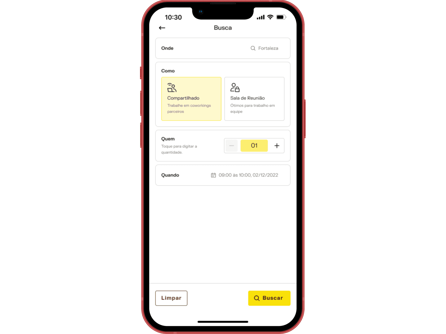
Unified search starts here: Where? When? What type? How many? Capturing constraints upfront instead of discovering unavailability at checkout.
The options by product type were an important insight. Instead of mixing everything in a generic list, users could quickly toggle between categories. Want to see workstations? Just tap. Want to see rooms? Tap again. Want to see event spaces? And tap once more.
And then came what users wanted: after defining criteria, the listing showed only what matched. No seeing 50 spaces where 45 are unavailable.
But there was more. What if a user's favorite space isn't available? We needed to explain why.
Exception messages: the UI gives you contextual guidance
One thing is not showing an unavailable space. Another is leaving users without understanding why their favorite space disappeared out of a sudden.
So we started writing contextual exception messages directly in the listing:
"Insufficient capacity"
"Unavailable at this time"
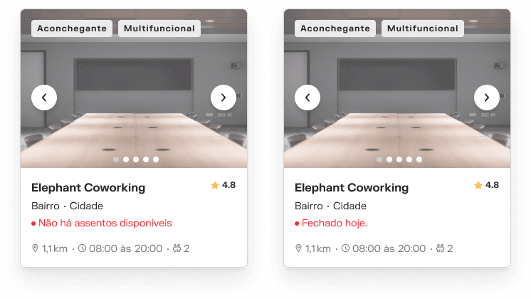
Available spaces highlighted with clear CTAs, unavailable ones with contextual explanations (insufficient capacity, unavailable at this time).
It wasn't just a "no." It was a "no, and here's why." The interface teaches the business rule without requiring users to read a manual.
This applied a principle I used in other projects (and that would later become central in the Flexible Subscription squad): instructive WYSIWYG. What You See Is What You Get.
Adapting the Design System to fit the new flow
Listing cards needed special attention. Woba's Design System had card components, but they weren't prepared to communicate availability states clearly.
I redesigned the visual hierarchy:
Available = highlighted, visible call-to-action.
Unavailable/Exception = secondary state, with explanatory message.
Skeleton states = placeholders while loading.
Empty states = when search returns nothing, with suggestions on what to do.
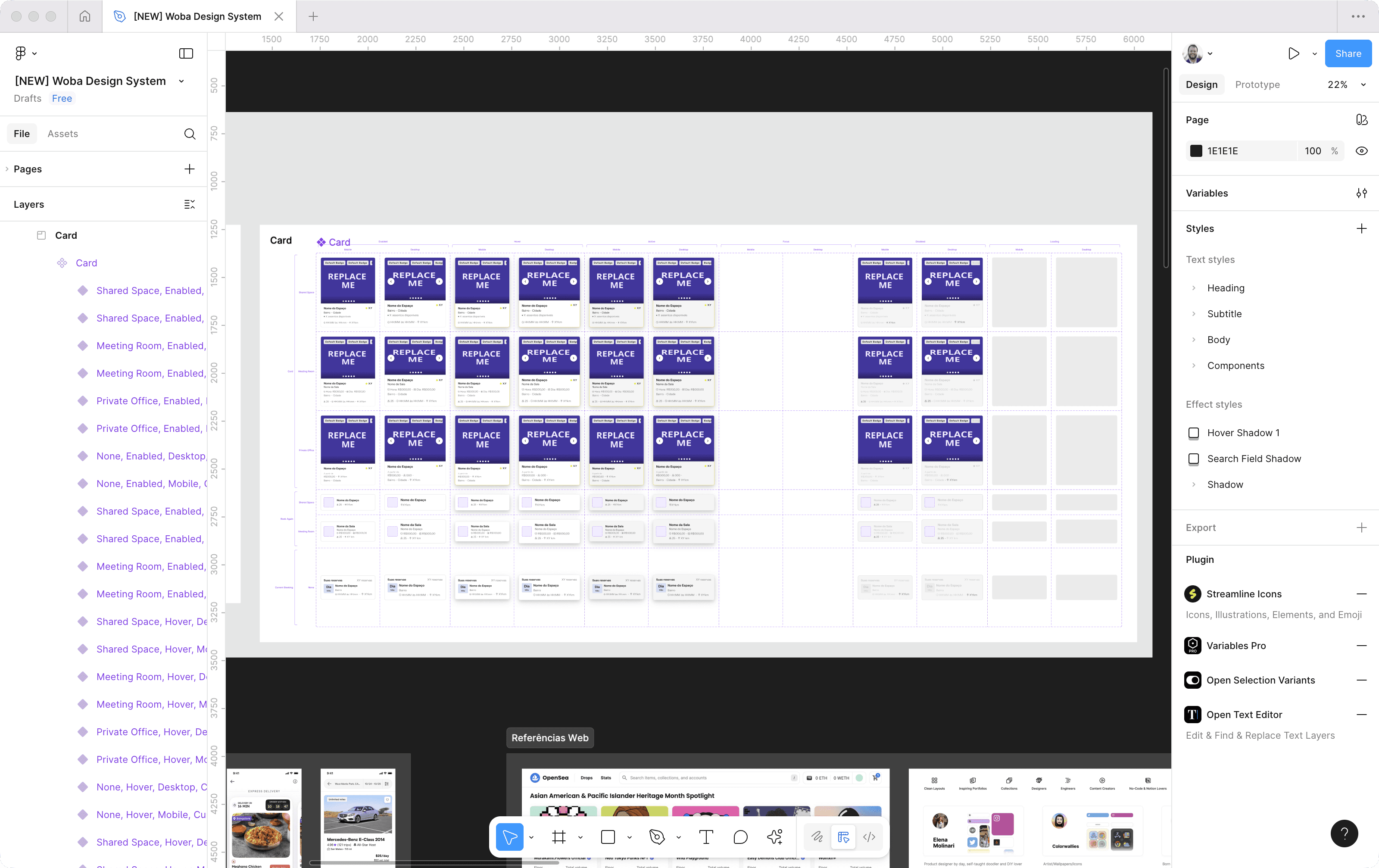
Systematic view of the card component and its many variants: available, unavailable, skeleton, empty states. Each serving a purpose.
Each detail served to reduce cognitive friction and speed up decision-making.
Validation: prototypes, tests, and a SUS score of 85.63
I built interactive prototypes in Figma and ran internal usability tests with people from different areas (not just design/tech, but also CS, Sales, operations).
I used the System Usability Scale (SUS), academic and industry standard, to measure usability perception. The result? 85.63 average.
For context: above 68 is already considered "above average." Above 80 is "excellent." 85.63 meant we'd nailed it.
Qualitative feedback was also positive:
"Much faster than before"
"Finally don't have to keep going back"
"Now I can understand why a space doesn't appear"
Some questioned whether asking everything upfront wasn't "too much information at once." But tests showed it wasn't. On the contrary, providing clarity from the start reduced anxiety.
What changed (and what remained to be measured)
Unified Search was implemented in iOS and Android apps throughout 2023. The qualitative impact was immediate: internal users and some clients who tested before full rollout reported much smoother experience.
But here's a confession: we didn't have complete tracking of the search-to-fill metric in the first version. Because of timing and prioritization.
The squad was focused on delivering functionality and validating direction before instrumenting granular events in Amplitude. The idea was: validate the concept first, measure everything later.
So what did we know for sure?
Reduction in back-and-forth between listing and details (observable in tests).
Faster understanding of what was available (validated in SUS and feedback).
Fewer frustrations reported to Support (informal observation, but very consistent).
The precise quantitative impact on search-to-fill conversion? That remained an opportunity for improvement. It was the natural next step, but the squad was redirected to other priorities before that happened.
A valuable trade-off: API cost vs. user experience
There's an important technical detail here. Checking availability before showing results means more API calls. Instead of listing everything and checking only when users click, you validate upfront.
This has computational cost. I talked to the engineering teams about this. It was clear to the team that the cost of a bad experience (users giving up, reaching out to account managers, negative product perception) was much higher than the processing cost.
Instead of running numerous searches because results vary with availability, pulling restrictive parameters to the beginning was less costly.
What I learned (and what I carried to other projects)
Capturing parameters early reduces error and frustration when availability is restrictive. This became a principle I later applied in Partner Dashboard, Financial Control, and even Flexible Subscription.
Messages in listing teach rules without depending on external documentation. UI can and should be educational. Don't force users to guess.
Qualitative validation (SUS, tests) is as valuable as quantitative metrics. Especially in early phases. If users understand and approve the concept, you're on the right track. Then instrument and refine.
And about prioritization: you can't always measure everything in the first version. And that's okay. What matters is documenting what's pending and having a plan to return to it.
The foundation was laid
Unified Search wasn't perfect. We didn't have all the metrics I wanted. But it fundamentally changed how users interacted with the app when looking for spaces.
It transformed a chaotic and frustrating process into a predictable and reliable flow. And established patterns like product chips, upfront availability, exception messages, adapted cards, that would influence other projects at Woba.
It was the beginning of something good: redesigning complex experiences focusing on clarity and empathy.